Te Pūnaha Matatini intern Shih-Hao (Samuel) Chen talks about his work with Nebula Data over the 2019-20 summer developing a tool that provides enhanced network analysis capabilities.
By Shih-Hao (Samuel) Chen
Networks arise in all shapes and forms in our everyday lives, and their features can provide new information to its respective topic. However, a list of nodes and edges alone is challenging to interpret, and transforming the dataset into a useful visualisation relies on inflexible third-party applications. We wanted to build a supportive, customisable tool that would enable data analysts to uncover new observations.
How does one analyse networks?
Networks are a group of nodes (things) and edges (relationships). The analysis of these networks provides answers to questions that otherwise would be difficult to answer, such as which bus stops have the most traffic, or which characters appear the most in a movie.
The question then arises – how does one analyse networks? The answer is to use a network visualisation and processing application. Gephi is a well-known application that provides this functionality, but Gephi has limitations in terms of user controllability. Our task was to produce an alternative software, but with more flexibility and control from an analytical perspective. For example, our product may offer more colouring schemes, alternative algorithms or additional forces.
When presented with a list of nodes and edges, a computer has no intuitive method of drawing the network. After all, the visualisation is purely aesthetic. The solution is to implement a force-directed algorithm that transforms the nodes into a “natural” layout. We can see the result in Figure 1:
Figure 1. Demonstration of a force-directed network in action.

The network in this visualisation is slowly untangling, allowing us to identify central nodes and clusters.
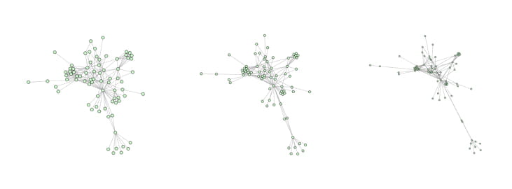
We created our application hoping for flexibility and customisation. Upon further reading, we found that the attraction/repulsion ratio between the nodes determines the resultant network shape. As shown in Figure 2 below, we can see how the visualisation algorithm can dramatise clustering by changing the forces alone.
Figure 2. Three different attraction/repulsion force ratios, and its resultant shapes.
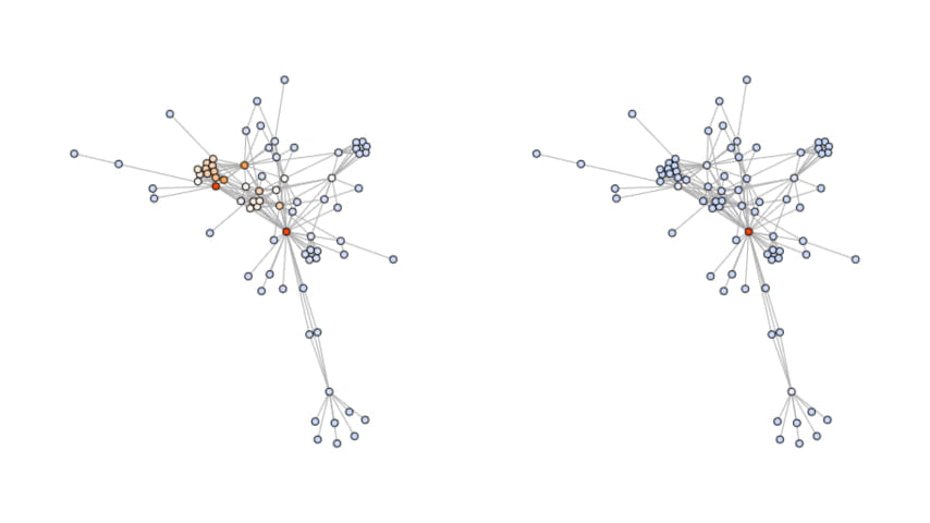
Although these observations are informative, metrics and values help form reliable claims on these networks. By colouring the nodes based on some measure, the application presents the information in a reader-friendly way. Figure 3 below illustrates two examples of analyses that the app supports:
Figure 3. Katz (left) and Betweenness (right) Centrality, highlighted by the colouring of the nodes.
Finally, our application also provides a time-lapse feature, where we can observe how graphs change over time. The insertion/removal of nodes and edges will change the shape of the network and analysts can use these changes to make observations.
Where to next?
Although these features are incredibly useful for uncovering hidden stories of networks, there are plenty of features that could provide further insight into the relationships around us. Community detection, for example, is an exciting field that groups nodes of high connectivity together. There are also visual features, such as nodes-overlap prevention, that would improve readability.
Author
Shih-Hao (Samuel) Chen is currently studying a Bachelors of Engineering, specialising in Software Engineering. Samuel enjoys problem-solving and is incredibly fascinated with the complex nature of algorithms.